v0.26.0
https://github.com/ratatui/ratatui/releases/tag/v0.26.0
⚠️ See the breaking changes for this release.
FOSDEM 📢
At the time this release is published, one of our maintainers (Orhun Parmaksız) will be giving an introductory talk about Ratatui at FOSDEM! The talk will be also recorded and streamed live.
See the event details here.
If you are around in person, don’t miss the chance to get some Ratatui stickers!
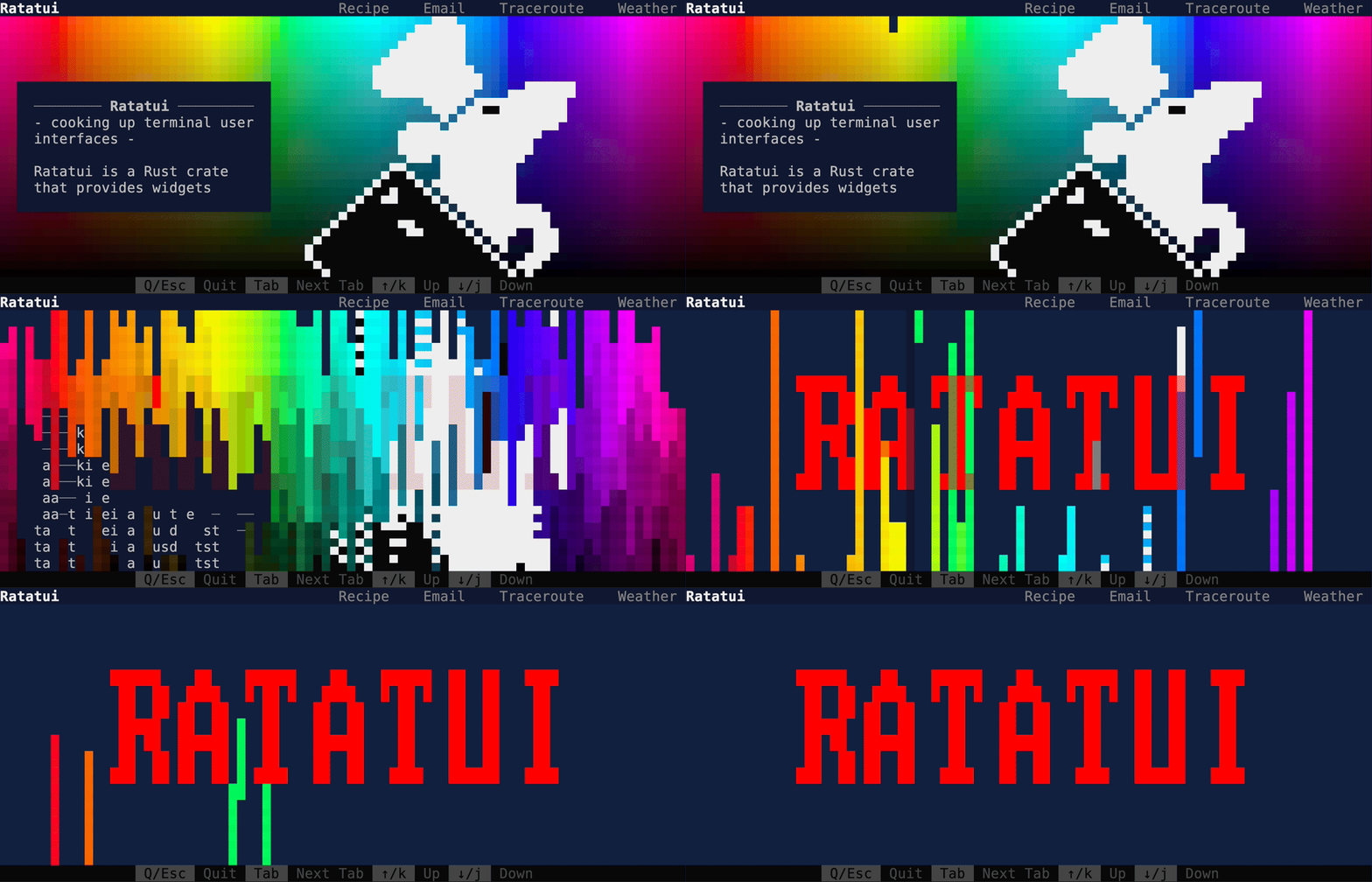
Demo: Destroy Mode 💥
We have a brand new demo which has a destroy mode! (Made for celebrating the 1000th commit of Ratatui)

To run it:
cargo run --example demo2 --features="crossterm widget-calendar"Press d to activate destroy mode and enjoy!
Ref Widget Implementation 🧩
Many widgets can now be rendered without changing their state.
We implemented WidgetRef trait for references to widgets and changed their implementations to be
immutable. This allows us to render widgets without consuming them by passing a ref to the widget to
Frame::render_widget(). It also allows boxed widgets to be rendered.
Note: this trait is gated behind a feature flag unstable-widget-ref. The approach we take might
change for this (as there are approaches that would allow the code below to just use Widget
instead of WidgetRef).
// this might be stored in a structlet paragraph = Paragraph::new("Hello world!");
let [left, right] = area.split(&Layout::horizontal([20, 20]));frame.render_widget(¶graph, left);frame.render_widget(¶graph, right); // we can reuse the widget
let widgets: Vec<Box<dyn WidgetRef>> = vec![Box::new(Line::raw("hello"), Span::raw("world"))];for widget in widgets { widget.render_ref(area, &mut buf);}Layout: flex ✨
We now support a new way to space the elements in a Layout: Flex! We added a Flex enum loosely
based on flexbox:
Flex::Start(new default)Flex::CenterFlex::EndFlex::SpaceAroundFlex::SpaceBetweenFlex::Legacy(old default)

In addition to changing the default to Flex::Start, we have made a couple of changes to the
constraints.
Min(v)grows to allocate excess space in allFlexmodes instead of shrinking (except inFlex::Legacywhere it retains old behavior).- We added a new constraint variant
Fill(1)that grows to allocate excess space, growing equally withMin(v).
While is a breaking change to the behavior of constraints, most users should see identical layouts
with the new Flex::Start, especially if Min() is one of the constraints. However, you want the
old behavior, you can use Flex::Legacy:
Layout::vertical([Length(25), Length(25)]).flex(Flex::Legacy)We have also removed the unstable feature SegmentSize.
Check out the pull request for the motivation behind this feature and more information.
We have also built a constraint-explorer TUI that will allow you to compare how constraints behave
in different Flex modes. Check out the pull request
for a video demo of the constraint-explorer.
Color Palettes 🎨
There are two brand new colors palettes ready to use, Material and Tailwind.
The
ratatui::style::palette::material
module contains the Google 2014 Material Design palette.
use ratatui::style::palette::material::BLUE_GRAY;Line::styled("Hello", BLUE_GRAY.c500);The
ratatui::style::palette::tailwind
module contains the default Tailwind color palette. This is useful for styling components with
colors that match the Tailwind color palette.
use ratatui::style::palette::tailwind::SLATE;Line::styled("Hello", SLATE.c500);See https://m2.material.io/design/color/the-color-system.html#tools-for-picking-colors and https://tailwindcss.com/docs/customizing-colors for more information.
Alignment Convenience Functions 🏗️
We added the following alignment convenience functions for Line, Paragraph and Text:
Line::from("align on left").left_aligned();Line::from("centered!").centered();Line::from("align on right").right_aligned();
Same applies for Paragraph and Text e.g. Paragraph::new("Hello, world!").centered().
Span on the other hand has the following new methods:
let span = Span::styled("Test Content", Style::new().green().italic());
// convert span to left-aligned linelet line = span.to_left_aligned_line();
// convert span to right-aligned linelet line = span.to_right_aligned_line();
// convert span to center-aligned linelet line = span.to_center_aligned_line();
Padding: New Constructors 🏗️
Padding has new constructors:
Padding::proportional(4);: make horizontal and vertical padding seem equalPadding::symmetric(5, 6);: defines left and right paddingPadding::left(3);: defines left paddingPadding::right(3);: defines right paddingPadding::top(3);: defines top paddingPadding::bottom(3);: defines bottom padding
Block: bordered 🧱
Block has a new constructor method named bordered for avoiding creating a block with no borders
and setting Borders::ALL.
So you can simplify your code as follows:
Block::default().borders(Borders::ALL);Block::bordered();Color: New Constructors 🏗️
Color can be constructed from u32 values now. The format is 0x00RRGGBB:
let white = Color::from_u32(0x00FFFFFF);let black = Color::from_u32(0x00000000);We also added from_hsl method for constructing Color::Rgb values.
let color: Color = Color::from_hsl(360.0, 100.0, 100.0);assert_eq!(color, Color::Rgb(255, 255, 255));
let color: Color = Color::from_hsl(0.0, 0.0, 0.0);assert_eq!(color, Color::Rgb(0, 0, 0));
HSL stands for Hue (0-360 deg), Saturation (0-100%), and Lightness (0-100%) and working with HSL the values can be more intuitive. For example, if you want to make a red color more orange, you can change the Hue closer toward yellow on the color wheel (i.e. increase the Hue).
Layout: Increase Cache Size 📈
We increase the default cache size of layout from 16 to 500.
This is a somewhat arbitrary size for the layout cache based on adding the columns and rows on my laptop’s terminal (171+51 = 222) and doubling it for good measure and then adding a bit more to make it a round number. This gives enough entries to store a layout for every row and every column, twice over, which should be enough for most apps.
For those that need more, the cache size can be set with Layout::init_cache().
See the relevant discussion in this issue.
Layout: Horizontal and Vertical Constructors 🏗️
The Layout now allows to create a vertical or horizontal layout with default values with the
following constructors:
let layout = Layout::vertical([Constraint::Length(10), Constraint::Min(5)]);let layout = Layout::horizontal([Constraint::Length(10), Constraint::Min(5)]);Layout: Accept Constraints 📐
The Layout constructors now accept any type that implements Into<Constraint> instead of just
AsRef<Constraint>. This is useful when you want to specify a fixed size for a layout, but don’t
want to explicitly create a Constraint::Length yourself.
Layout::new(Direction::Vertical, [1, 2, 3]);Layout::horizontal([1, 2, 3]);Layout::vertical([1, 2, 3]);Layout::default().constraints([1, 2, 3]);Layout: spacing 📏
Spacing can now be added between the items of a layout.
let layout = Layout::horizontal([Length(20), Length(20), Length(20)]).spacing(2);Rect: contains 🔲
If you want to perform hit tests, this new method is for you. (e.g. did the user click in an area)
Rect::new(1, 2, 3, 4).contains(Position { x: 1, y: 2 }) // trueWe also added the Position struct for storing the x and y coordinates (columns and rows).
Rect: clamp 🦞
There is a new useful method when you want to be able to dynamically move a rectangle around, but keep it constrained to a certain area.
For example, this can be used to implement a draggable window that can be moved around, but not outside the terminal window.
let window_area = Rect::new(state.x, state.y, 20, 20).clamp(area);state.x = rect.x;state.y = rect.y;Layout: areas and spacers methods 🍌
Now you can split a Rect into multiple sub-Rects in a more concise way:
use Constraint::*;let layout = Layout::vertical([Length(1), Min(0)]);let [top, main] = layout.areas();let [above, inbetwee, below] = layout.spacers();Rect: Rows/Colums Iterators 🔲
This enables iterating over rows and columns of a Rect this simplifies looping over cells.
let area = Rect::new(0, 0, 3, 2);let rows: Vec<Rect> = area.rows().collect();let columns: Vec<Rect> = area.columns().collect();Table: Accept Constraints 📊
Table constructors now accept any type that implements Into<Constraint> instead of just
AsRef<Constraint>. This is useful when you want to specify a fixed size for a table columns, but
don’t want to explicitly create a Constraint::Length yourself.
Table::new(rows, [1,2,3])Table::default().widths([1,2,3])Table: Accepts Iterator 📊
Previously, Table::new() accepted IntoIterator<Item=Row<'a>>. The argument change to
IntoIterator<Item: Into<Row<'a>>>, This allows more flexible types from calling scopes, though it
can some break type inference in the calling scope for empty containers.
let table = Table::new(vec![], widths);// becomes let table = Table::default().widths(widths);This also means that any iterator whose item is convertible into Row can now be collected into a
Table.
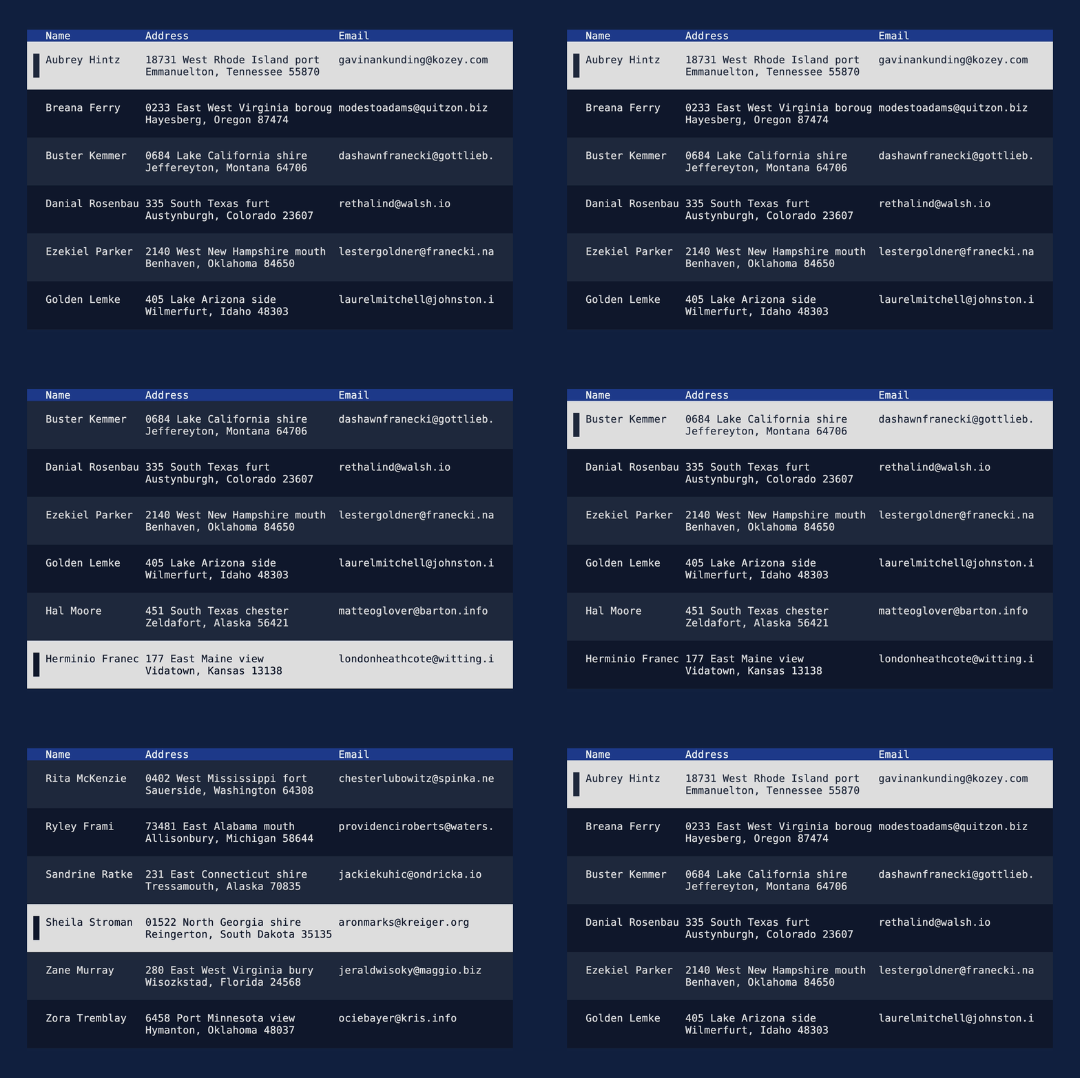
Table: Accept Text as highlight symbol 📊
You can now use multi-line symbols for highlighting items in a table.
let table = Table::new(rows, widths) .highlight_symbol(Text::from(vec![ "".into(), " █ ".into(), " █ ".into(), "".into(), ]));See the demo

Table: footer 📊
Table now has a footer method for setting the rows that will be displayed at the bottom.
let footer = Row::new(vec![ Cell::from("Footer Cell 1"), Cell::from("Footer Cell 2"),]);let table = Table::default().footer(footer);Along with that, there is a new top_margin method of Row:
let row = Row::default().top_margin(1);Widget Implementation 🧩
Line and Span now implements Widget which means it can be used as a child of other widgets.
You can also use Line::render() to render it rather than calling buffer.set_line().
frame.render_widget(Line::raw("Hello, world!"), area);// orLine::raw("Hello, world!").render(frame, area);Same applies to Span and you can use Span::render() to render it rather than calling
buffer.set_span().
Line: styled 🎨
Previously the style of a Line was stored in the Spans that make up the line. Now the Line
itself has a style field, which can be set with the Line::styled method.
let style = Style::new().yellow();let content = "Hello, world!";let line = Line::styled(content, style);Any code that creates Lines using the struct initializer instead of constructors will fail to
compile due to the added field. This can be easily fixed by adding ..Default::default() to the
field list or by using a constructor method (Line::styled(), Line::raw()) or conversion method
(Line::from()).
let line = Line { spans: vec!["".into()], alignment: Alignment::Left, ..Default::default()};Style: Accept Into 🎨
All style related methods now accept S: Into<Style> instead of Style. Color and Modifier
implement Into<Style> so this is allows for more ergonomic usage. E.g.:
Line::styled("hello", Style::new().red());Line::styled("world", Style::new().bold());
// can now be simplified to
Line::styled("hello", Color::Red);Line::styled("world", Modifier::BOLD);
This means that if you are already passing an ambiguous type that implements Into<Style> you will
need to remove the .into() call.
Tabs: Accept Iterator of Line 📑
Previously Tabs::new required a Vec, it can now accept any object that implements IntoIterator
with an item type implementing Into<Line>.
Calls to Tabs::new() whose argument is collected from an iterator will no longer compile.
For example, Tabs::new(["a","b"].into_iter().collect()) will no longer compile, because the return
type of .collect() can no longer be inferred to be a Vec<_>.
let table = Tabs::new((0.3).map(|i| format!("{i}")).collect());// becomes let table = Tabs::new((0.3).map(|i| format!("{i}")));New Border Sets 🔲
We added the McGugan
border set, which allows for tighter borders.
Wide border set based on McGugan box technique:
▁▁▁▁▁▁▁▏xxxxx▕▏xxxxx▕▔▔▔▔▔▔▔Tall border set based on McGugan box technique:
▕▔▔▏▕xx▏▕xx▏▕▁▁▏Terminal: Frame Count 🔢
You can now get the current frame count!
let mut frame = terminal.get_frame();let current_count = frame.count();println!("Current frame count: {}", current_count);This count is particularly useful when dealing with dynamic content or animations where the state of the display changes over time. By tracking the frame count, developers can synchronize updates or changes to the content with the rendering process.
Buffer: SSO 🐜
We now apply SSO (small string optimization) technique to text buffer in buffer::Cell i.e. use
CompactString instead of String to store the Cell::symbol field. This saves reduces the size
of memory allocations at runtime.
See the related discussion here.
Other 💼
- Rename
Constraint::ProportionaltoConstraint::Fill(#880) - Add Rect -> Size conversion methods (#789)
- Implement
DisplayforText,Line,Span(#826) - Support de/serialization of TableState, ListState, and ScrollbarState via
serdefeature - Implement FromIterator for Row (#755)
- Add
Fromfor termwiz style (#726) - Add style and alignment to
Text(#807) - Collect iterator of
ListItemintoList(#775) - Remove deprecated
Block::title_on_bottom(#757) - Make
patch_styleandreset_stylechainable (#754)

